[Case 03]
Dental Healthcare
Healthcare
Dental Healthcare
Simplifying Scheduling, Reminders, and Patient Access
[Project Overview]
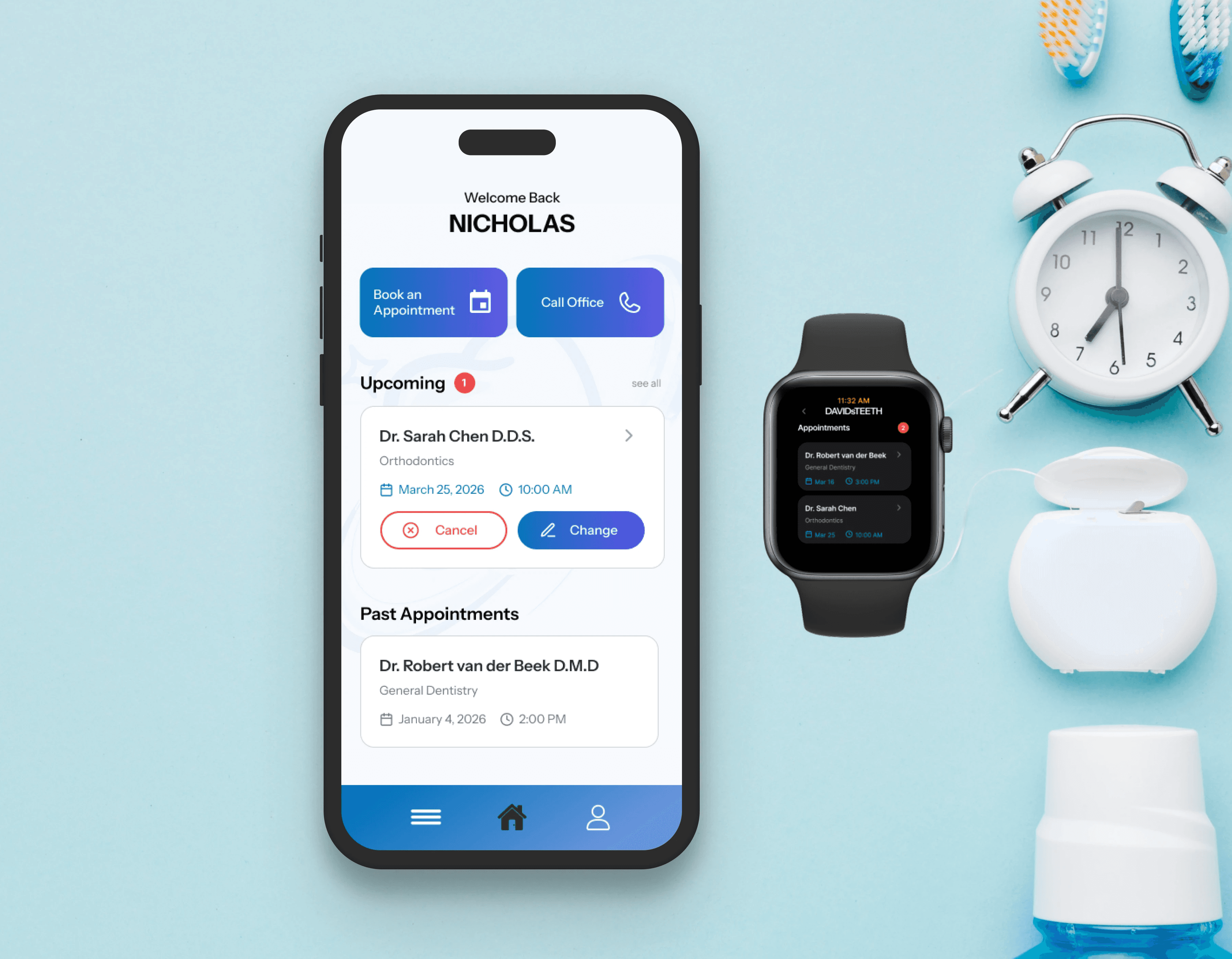
A mobile and smartwatch dental care app that enables patients to register, book and manage appointments, receive reminders, and access clinic information through a streamlined, multi-device experience.
[Problem Statement]
Patients rely on phone calls, emails, and unclear booking tools to manage appointments. This causes friction and confusion, leading to missed bookings and difficulty making changes quickly.
[Industry]
Healthcare
[My Role]
UX Designer
[Platforms]
Mobile (iOS/Android)
[Timeline]
February 2026- March 2026
[Persona]

Tessa Gray
Architectural Intern
I’m a busy young professional who relies on my phone and want a quick, clear way to book and manage dental appointments.
Age: 23
Location: Vancouver
Tech Proficiency: Moderate
Gender: Female
[Goal]
Book and manage appointments quickly.
Receive clear, timely reminders.
Access key clinic info without friction.
[Frustrations]
Long or confusing booking processes
Reliance on phone calls
Unclear or easy-to-miss reminders
[Process]
[01] User Research
Reviewed secondary research on digital health behaviour and appointment systems
Identified usability issues in existing booking systems (multi-step flows, unclear feedback)
Conducted peer feedback and heuristic evaluations during prototyping
[02] Insights
Users prioritise speed and minimal steps
Reminders must be concise, visible, and actionable
Complex flows and dense layouts reduce adoption
[03 Design Solution]
Simplified booking into 3 steps: select provider, choose time, confirm
Centralised appointment management (view, reschedule, cancel)
Integrated smartwatch for glanceable reminders and quick actions
[04] Testing & Iteration
Improved colour contrast and typography for accessibility
Removed unnecessary navigation to reduce cognitive load
Added swipe navigation on watch based on usability feedback
[Outcome]
Reduced steps required to complete booking
Improved clarity of appointment information and reminders
Increased usability across mobile and wearable contexts
[Key Learnings]
Simplification is key
Users value a quick and easy process, especially on mobile.
Iterative testing pays off
Mobile and smartwatch support improves reminder and appointment continuity.
Details matter
Changes to contrast, spacing, and navigation made the experience clearer and easier to use.